|
|
Pixel Art Character, Adobe Illustrator, (3/28/24)Artwork Selection: I'm proud of this because it is simple yet intriguing and stylish.
Explanation Clarity: I was inspired by my love for unique and imaginative characters, as well as my passion for color theory. Artistic Process: I began brainstorming this character's design by reviewing other pixel art designs (specifically Undertale sprites). I then began sketching the character in different poses and angles, before finally settling on the final design. Technical Skill: I used my skills on color theory, designing, and sketching. Aesthetic Considerations: I used one of my favorite color palettes (pink and blue). I also tried to add some elements that made the character more interesting, such as the pink and blue gloves and the gold elf-like boots. |
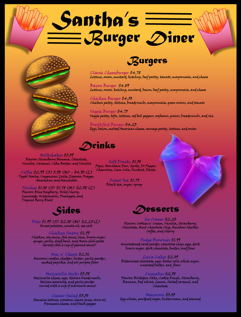
Burger Diner Menu, Adobe Illustrator, (3/28/24)Artwork Selection: I'm proud of the menu artwork because of its creative use of colors and details. I'm also proud of the fact that I managed to compose it in a visually pleasing way.
Explanation Clarity: I wanted to create a menu that would attract viewers and make them feel like they were in a tropical paradise. Artistic Process: I wanted to make the menu have a more "tropical" vibe to it. So, I used a color palette conveying sunset colors, featuring yellow, red, blue, and purple. The 3D burgers stacked on top of each other create an eye-catching design element that draws attention to the "burgers" section. The 2D fries on each side of the diner's title add a fun and playful element, while the 3D galaxy-colored slushees next to the "drinks" section make the meal options more interesting. Technical Skill: I used what I learned about emphasis as well as how to create my own shapes using shape building and the mesh tool. The use of 3D elements and shadows adds depth and dimension to the design. Additionally, the use of borders, lines, and shapes helps to visually separate each item on the menu. Aesthetic Considerations: In terms of aesthetic considerations, I ensured that the artwork reflects my personal style by incorporating tropical paradise-like colors that convey a sunset-like atmosphere. The black border around the menu adds a more polished and professional touch. |
|
|
|
"Devil's Reaper" Badge, Adobe Illustrator, (3/28/24)Artwork Selection: I'm proud of the badge artwork because it's a simple design that's able to create a dark and ominous atmosphere.
Explanation Clarity: I was inspired by the different stories and myths I heard about the Grim Reaper when I was much younger. Artistic Process: I brainstormed ideas for a badge that conveys the theme of devil and hell. Once the concept of crossed scythes was established, I focused on refining the design and color palette. Technical Skill: I employed my skills on color theory and shading. The use of bright and bold colors creates a sense of energy and aggression. The use of shading adds a sense of depth and texture. Aesthetic Considerations: This represents my personal interests in dark and supernatural themes, such as death and the Grim Reaper. The main color scheme of red and black creates a menacing and ominous vibe, while the crossing of the scythes adds a sense of power and ferocity. The name "Devil's Reaper" adds to the overall dark theme of the artwork. |
"Around The World" Badge, Adobe Illustrator, (3/28/24)Artwork Selection: I'm proud of this artwork because it represents a fun and playful concept that combines the imagery of a rocket launch with the colors of a rainbow as its trail. The colors used in this artwork (pink, yellow, blue, and purple) also create a vibrant and visually striking composition.
Explanation Clarity: This artwork uses a rainbow trail behind a rocket to give the audience a sense of travel and wonder. The title "Around the World" implies that the rocket is traveling in a circular pattern or going around the world. Artistic Process: I brainstormed different ways to represent space travel and exploration. To add more visual interest, I decided to use a rainbow trail. Technical Skill: I used the skills that I learned in Adobe Illustrator, as well as the color theory I learned in the previous quarter. Aesthetic Considerations: I wanted to create a composition that is playful and vibrant. The choice of color, which is pink, yellow, blue, and purple, adds to the overall aesthetic of the artwork (to be honest, I like rainbows). The use of stars is supposed to add to the feeling of the wonders of the world (traveling). |
|
|
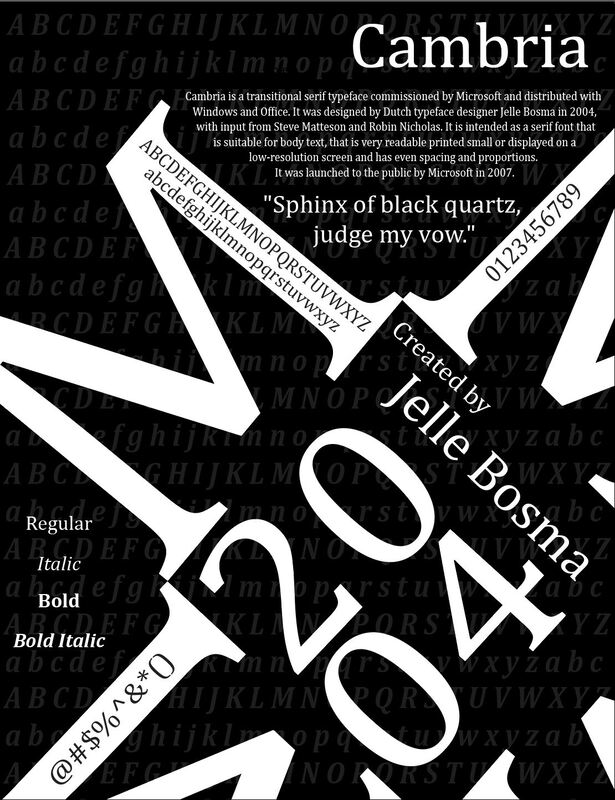
Typeface Poster, Adobe Illustrator, (3/28/24)1. Artwork Selection: I am proud of this artwork because I was able to come up with an idea for how I wanted to present this typeface; I was able to make a more creative display. I also like how I used the "M"s.
2. Explanation Clarity: This is a poster that showcases the typeface "Cambria." The four "M" letters were used to form a star-like shape, leaving a large square shape in the center. The year "2004" (for when the font was created) and the name of the creator, Jelle Bosma, are also displayed within this square space. The uppercase and lowercase letters of the alphabet are repeated in a pattern-like way as the background, adding to the overall visual impact. I used this type of layout to create a unique and eye-catching design. 3. Artistic Process: I chose to use four "M"s to form a star-like shape as a creative way to display the typeface "Cambria." The use of a black and white color scheme is to help create a bold and striking design. I then used the "M"s to place notable information on them, and added in the history at the top with the quote underneath it. 4. Technical Skill: The technical skill in this artwork mainly includes the use of my Adobe Illustrator skills to create and adjust the various elements that make up the poster. I used what I previously learned to create and manipulate the "M" letters and other lettering, as well as my own imagination to come up with the composition. 5. Aesthetic Considerations: This displays my aesthetic awareness through the visual impact of the poster. The use of black and white colors creates an eye-drawing design, while the transparent letters in the background add a subtle touch. The placement of the letters is to create a dynamic and visually interesting design. |
